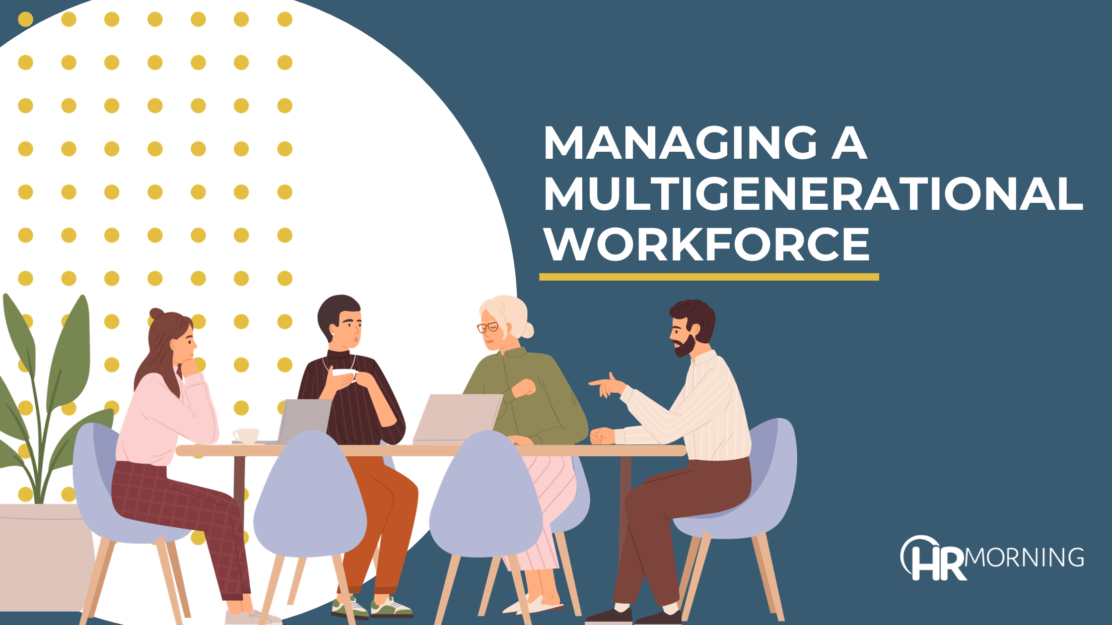
We all need that little something to spice up benefits meetings, and PowerPoint is a pretty good tool for that — just not if you believe these common misconceptions:
- People want pictures. Yes, PowerPoint’s made it easy to load up your presentation with pretty pics — but too often it just leads to dense, incomprehensible charts that clutter the message. A small picture every few slides is OK. But most of the time pics can be replaced with a few words.
- You can’t go on without it. Ask yourself this question: If my PowerPoint got erased, could I still give my presentation? If the answer is “no,” you’re relying on it too much. Remember, PowerPoints are for supporting and enhancing your presentation — not giving it for you.
- Be as brief as possible. It’s possible to go too far in the other direction as well. One- to two-word slides don’t help convey any message — at least not one that’s easily understood. One way to ensure you’re not relying too much or too little on PowerPoint: Follow the 10/20/30 rule, which says keep all presentations to less than 10 slides and no more than 20 minutes — and use a font size of at least 30.
Looking for added punch?
While it’s possible to make visually stunning benefits presentations with PowerPoint, there are only so many tricks you can use — and your audience has probably seen most of them.
Enter Prezi — a new online tool that gets rid of individual slides for one large presentation space. You input your content and then set the path you want your presentation to take through the info, producing a neat visual effect (check out the video demo).
You can use Prezi for free, or sign up for a subscription to remove the watermark, get more storage space and access an offline editor.